
Source: Moosend
Landing pages need to look appealing, but most of all they need to convert.
Russell Brunson, (New York Times Bestselling Author & Co-Founder of ClickFunnels)
How about starting with one of the most crucial questions with which website owners and marketers deal every day: “How to convince the visitors to take a plunge on their B2B websites?”
Well, there might be millions of articles floating on the internet talking about different marketing techniques that help you pull your target audience to your online business!
However, sometimes developing a high-converting B2B landing page is sufficient for driving conversions and bringing in the big bucks!
If you explore the web landscape, you will find hundreds of resources discussing the importance of robust landing pages.
Still, rarely does any one of them spill the beans on how to develop a B2B landing page that will yield 171% more engagement and push leads down your sales funnel to boost conversions.
There’s no rocket science in building a high-converting landing page, but before starting to develop, you must brush-up your fundamentals
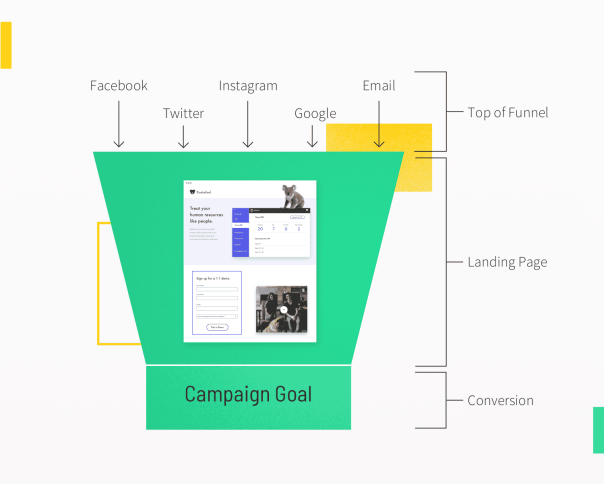
How Would You Define A High-Converting Landing Page?
A high-converting B2B landing page is dedicated pages of your website specifically designed to provide the visitors with a seamless experience and boost conversions with a tailored message that resonates with the prospects’ specific requirements.
Action-oriented landing pages help businesses to move prospects through every stage of the buyers’ journey.
Landing pages are the best alternatives for decreasing your lead acquisition costs and boosting your marketing campaigns’ conversion rates.
Along with designing a high-converting B2B landing page, you must build a flawless B2B website that attracts the right leads and has the capacity of turning them into paying customers.
If you want some inspiration, you can explore a few outstanding design portfolio websites so that you can craft a seamless digital experience for your clients, collaborators, and peers.
What’s The Purpose Of A Landing Page?
“Specific page(s) on a web site created for visitors referred from marketing campaigns, which are designed to achieve a marketing outcome.”
Dave Chaffey (Digital strategist, Co-founder & Content Director At Smart Insights)
B2B landing pages are different from other website pages as website owners design them with a specific purpose that’s a call-to-action button or CTA.
Source: Unbounce
A CTA button directs your target visitors towards your marketing goal conversion by persuading them to click on it for taking the desired action you want them to take that can be either a purchase, registration, or sign-up!
A B2B landing page’s key objective is to turn visitors into leads by gathering their information in exchange for exciting offers.
Designing a useful B2B landing page is tricky as the B2B landscape deals with complex offerings, various decision-making factors, lengthy sales cycles, etc.
Nothing great is designed without some inspiration, and that’s why we have compiled 31 unique B2B landing pages from which you can take inspiration and test for your business:
1. Kissmetrics
“Finally, a good landing page needs to portray trust and credibility to your audience: social proof is key and should be a feature of any landing page, especially for users still in the awareness or consideration phase(s) of your funnel.”
Christopher Nolan (Head Of Growth At ShipBob)
Kissmetrics designed a tailored landing page for the visitors who like to explore their marketing tools bundle:

Source: Wordstream
The Kissmetrics landing page’s best aspect is the minimalist form asking only the visitors’ email addresses.
The headline of the landing page is crisp and clear that elaborates the offer.
Plus, they have incorporated a bright and colorful CTA that pulls the attention of the visitors automatically.
Learning: Minimalism is the key to grab more leads.
2. HubSpot
HubSpot has created a highly engaging landing page where they’ve described the perks of using their CRM software to the audience in an engaging manner:

Source: Neil Patel
HubSpot knew that the primary inhibition their potential customers have is learning a CRM from scratch.
Hence, they narrowed down their messaging to convince the prospects that their CRM is worth trying!
The CTA button that says “Get HubSpot Free” is also quite interesting as the words like “Discount” or “Free” draw the attention of visitors quickly.
Learning: Before developing your B2B landing page, make sure that you know the preferences, pain points, and inhibitions of your ideal customers.
3. Shopify
The USP of Shopify’s landing page is that they’ve stuck to the “less is more” concept while designing it:

Source: Content Assassin
Rather than throwing leads with multiple questions, Shopify has made the first step for them extremely easy.
Visitors need to enter their email addresses, and they can start with the free trial!
Learning:
Make onboarding as easy as a breeze for your customers.
4. Zoho
“Don’t just write “click here” on your button. Provide specific details about what you want people to do.”
- Rachel Foster (B2B Copywriter & CEO At Fresh Perspective Copywriting)
As compared to Shopify or HubSpot, the landing page of Zoho is a little more complicated. However, the messaging is extremely powerful:

Source: UserGuiding Blog
They’ve used more text on their landing page.
Still, it justifies their purpose of persuading prospects to begin the free trial, which automatically alerts the prospects that they have to pay once their free trial ends if they want to continue their subscription.
Encouraging someone to pay for your services is extremely hard, which is why more text in their messaging is a testimony of potential copywriting that drives more free-trial registrations!
Learning:
Sometimes, breaking the stereotypes isn’t wrong to serve your purpose.
5. Slack
If you need to up your landing page gameplan, there’s no one better to take inspiration from than Slack.
Look how interactive their landing page is, along with a bold and big headline:

Source: Crazy Egg
One of Slack’s landing page’s most engaging elements is that they’ve added a 5-seconds gif to demonstrate how easy it is to use their software.
Plus, adding customer testimonials at the bottom of the landing page is proof of their authority and credibility in the marketplace.
Learning: Showing proof that your customers love your brand is the best technique to grab new leads.
6. SproutSocial
SproutSocial has created a no-nonsense landing page that’s quite engaging and minimalistic at the same time:

Source: Filed
A strong headline that explains what SproutSocial is the most compelling element of the landing page.
The design is highly appealing that highlights the aesthetics with the help of screenshots.
Plus, the Green trial button right at the center dominates the entire page, along with a robust CTA titled “no credit card required,” which boosts the visitors to start their free trial.
Learning:
Right visuals and appealing color combinations can work wonders for your B2B landing page.
7. ActiveCampaign
The core purpose of ActiveCampaign’s landing page is to demonstrate how their software optimizes the customer experience:

Source: Neil Patel
This landing page convinces business owners that ActiveCampaign will be beneficial for them and their customers. The headline hits the bull’s eye as not a single extra word used in it.
Everything boils down to the green-colored CTA named “Start Your Free Trial,” precisely at the center of the landing page drawing the visitors’ attention, and it’s the most prominent element of the page.
Learning: Make CTA the hero of your B2B landing page.
8. Trello
Team collaboration is never easy, mostly when the team members work remotely, which is happening even more nowadays due to the ongoing pandemic.
Trello, which is one of the best team collaboration tools, has designed an impressive landing page:

Source: Get Response
Trello has addressed its customers’ pain points on the landing page by saying that it lets you work more collaboratively.
Defining and understanding your customers, preferences, and problems is one of the most crucial digital marketing strategies to ramp up your B2B sales.
Plus, the page is designed in such a manner that it evokes welcoming and amiable feelings.
Trello’s landing page doesn’t put the prospects under the pressure of signing up by embracing a laid-back approach.
Learning: Don’t push your product right in the face of your customers. For more information check out this Trello alternative.
9. Workable
The Workable landing page is one of the best examples of a fantastic lead generation landing page:
Source: ActuMarketing
An easy-to-fill and simple sign-up form is the most attractive part of the Workable landing page.
Also, there’s an option for the visitors to sign-up using any of their social media profiles.
The landing page’s design is minimalistic, and they’ve added testimonials to build trust in new visitors.
Learning: Provide options to your leads so they can take a quick call to sign-up for your brand.

10. CoSchedule
One of the most challenging tasks for marketers is to keep all the moving elements of their campaigns in one place.
CoSchedule has designed their landing page by keeping this pain point of their customers:

Source: Get Response
Because CoSchedule knows its customers quite well, their landing page copy does an excellent job writing product descriptions and presenting it as a hero in front of the visitors.
The landing page’s headline is straightforward as it tells the visitors what to expect from the offer.
The CTA is acting here as an extension of the headline, which is a brilliant way of reinforcing that their product is the right choice.
Also, CoSchedule has incorporated a sense of urgency into the landing page in the form of a limited time offer:

Source: Get Response
The limited-time offer encourages even the visitors who aren’t looking to sign-up, which increases the chance of conversions.
Learning: Infuse some thrill in your B2B landing page for persuading the visitors to turn into customers.
11. B2BQuotes
Usually, the CTA of B2B landing pages is very common such as “Start Your Free Trial” or “Request A Demo.”
However, B2B Quotes has done an excellent job by making their landing page CTA unique:

Source: Unbounce
The first highlight of this landing page is the engaging form placed at the top asking the visitors to fill in some necessary information.
The best element of the landing page is the prominent CTA titled: “Get 3 Quotes Now”.
By specifying the number of quotes visitors will get once they fill in their details, B2B Quotes have increased the chance of prospects turning into customers as such phrases add up to the thrill.
Imagine, if the CTA button said “Submit,” the visitors would have been clueless about what they might get after giving their information.
Now, as the visitors know what they are about to get, they will feel even more motivated to follow through!
Learning: Make your CTA stand out.
12. Teambit
Designing a B2B landing page full of cartoon characters might sound weird.
But Teambit has nailed its landing page with a simple one-field form along with an eye-catchy office set-up which is full of animal characters, and every one of them looks pleased with Teambit:

Source: HubSpot
The best part of Teambit’s learning page is that it’s a living testimony that you don’t need to have a “fun” product or service to build a fun and amiable landing page.
Every animal character on the landing page appears beside the informational sections persuading the visitors to scroll down and learn more automatically!
However, you can’t add fun or cartoon elements to any B2B landing page as you have to make sure that your design resonates with your brand’s mission and values.
If you want to craft relevant content or layout for your B2B landing page, taking help from the best B2B content marketing tools won’t harm you as they make it easier for you to create and promote high-quality content to your target audience!
Learning: Adding fun elements smartly to your landing page can make your conventional B2B products or services look much more enjoyable.
13. HootSuite
“Trust is always something you want to cultivate with your customer base and having testimonials, more often than not, perform better than not having them, especially if you’re trying to get a user to purchase something.”
Chris Lindekens (User Interface Design Expert & Art Director At Screen Scientific D & M)
There’s no denying the fact that HootSuite is one of the leading social media marketing software and they’ve maintained their legacy in their landing page as well:

Source: Wordstream
The HootSuite landing page’s best feature is that the visitors don’t have to fill multiple form fields as there’s an option to sign-in with trusted platforms like social media channels and Google.
Also, the landing page emphasizes that visitors can get started with the software for free.
Adding trust signals such as HootSuite’s clients to the landing page along with their testimonials is a smart move to win the trust of new visitors as it builds brand credibility.
Learning: If you are a brand name, there’s no harm in flaunting that on your landing page.
14. Webflow
Webflow is a popular design tool for developers, and its landing page is no less than a visual treat!
They have demonstrated a lot of information with the help of a gif beautifully:

Source: HubSpot
The center of attraction of the Webflow landing page is the engaging three form fields arranged on a single line.
Along with shortening the page, the single line three forms field makes visitors feel that they are so close to clicking on the blue button to get started for free after filling their details in the boxes from left to right.
The animated Gif below the sign-up form demonstrates to users how Webflow works, which is quite exciting.
Also, you can use one of the best online form builder tools to help you come up with a high-converting form for your B2B landing page.
Learning: Experiment with form positioning to make your B2B landing page visually engaging.
15. Salesforce
A market leader in the CRM niche, the Salesforce landing page is straightforward yet effective.
You won’t find any fancy elements such as visuals, gifs, or graphics on their landing page but what catches the attention is their short and sweet messaging

Source: IMPACT+
Salesforce landing page is minimalistic in looks, but the brand has made a compelling case to persuade their prospects why they should try their software.
They’ve also highlighted that the visitors will get a free trial for 30 days once they sign-up.
Salesforce has added an engaging headline at the top that says: “Grow Your Business with the World’s #1 Business CRM.”
Numbers are compelling and establish credibility for a B2B business that convinces potential leads to become paying customers.
Learning: Add numbers/data to your B2B landing page for driving more conversions.
16. Basecamp
“A good landing page needs to effectively answer the core sales objections the user will have. That could how much the thing will cost, what features it has, what it will look like, how it’s different from the competition, etc., etc. So, talk to prospective customers, or when failing that your sales team, make a list of the most common objections and ensure these are dealt with.”
- Andy Budd (Startup Advisor & Founder At Clearleft)
Basecamp is famous for coming up with unique post-click landing page designs that are quite imaginative, unique, and informative.
Here’s a creative landing page of Basecamp with minimalistic design and showcasing an inviting animated character that’s looking extremely interesting and fun:

Source: Instapage
Basecamp has used social proof in their headline, which is the testimony of their success.
By offering a 60 days free trial and not asking for a credit card to sign-up, they have tried to minimize conversion friction which is a great initiative to grab more leads.
They’ve also addressed the common questions on their landing page that help first-time visitors get their doubts cleared right away!
Learning:
Solve the most commonly asked questions by your visitors on your B2B landing page to build a strong connection and boost the chance of conversions.
17. Intercom
The Intercom landing page’s fundamental purpose is to boost their opt-in rates by persuading visitors to sign-up with their emails.
Their landing page looks enticing, with a prominent CTA convincing customers to begin their free trial:

Source: Neil Patel
The landing page’s headline is big, bold, and optimistic, which puts visitors in the right state of mind encouraging them to act now.
The images perfectly resonate with the headline’s USP.
Learning: Remember your primary objective while designing your B2B landing page.
18. ClickFunnels
ClickFunnels wants to convince visitors to begin a 14 days free trial, and they’ve designed a beautiful landing page to serve their core purpose:

Source: Fat Stacks Blog
The landing page has a lot of text, but it’s crucial when you want to put your point across and persuade visitors to sign-up with your brand.
Also, videos leave a long-lasting impression on the visitor because 80% of people prefer watching videos to reading blogs!
The analytics at the bottom of the page is the icing on the cake that proves that ClickFunnels values its customer success stories and keeps a record for every result!
Learning: Incorporating analytics in your B2B landing page is best for building trust in your potential customers and winning their loyalty.
The landing page’s headline is big, bold, and optimistic, which puts visitors in the right state of mind encouraging them to act now.
Plus, the images perfectly resonate with the headline’s USP.
Learning: Remember your primary objective while designing your B2B landing page.
19. Conversion Lab
“Landing pages are not wandering generalities. They are specific, measurable offers. You can tell if they’re working or not. You can improve the metrics and make them work better.”
Seth Godin, (Blogger, Author & Founder of altMBA)
Conversion Lab always split tests with their landing page CTAs with alternatives like “Get A Free Consult” or “Book A Call,” etc.
However, the landing page design has a unique element that’s the image of their founder, which helps the brand in building long-term relationships with their audience:

Source: Neil Patel
Another attractive aspect of the Conversion Lab landing page is its persuasive headline that draws visitors’ attention as soon as they arrive on the page.
Even if you aren’t ready to book a consultation call, you will get a pop-up asking for your email address to boost the chance of increasing email opt-in rates.
Learning: Showing a glimpse of your brand’s spine on your B2B landing page can grab more customers by building authenticity.
20. Unbounce
The landing page of Unbounce is exceptionally engaging, featuring a large image that tells the visitors what they are going to get, which is an eBook that helps you in increasing your conversions without getting over budget:

Source: IMPACT+
One of the best things about the landing page is that it highlights the value proposition in an easy-to-read manner.
Unbounce has used a visually appealing color combination to attract more visitors for signing up for their eBook.
There are social proofs on the landing page in the form of the logos of publications that are clients of Unbounce.
Learning: Tell visitors what they are getting in return for giving their information to increase your B2B landing page’s transparency.
21. LogMeInRescue
The landing page of LogMeInRescue demonstrates the value of their remote support software.
They’ve highlighted their unique selling points such as robust support, connectivity, and security, along with smartly leveraging little space to provide the context:

Source: Search Engine Journal
At the bottom of the page, LogMeInRescue has showcased its clients with their logos which is quite an engaging technique to draw visitors’ attention.
They’ve kept their sign-up form quite formal, and its headline is powerful, which says: “Get Two Weeks Free Of Rescue.”
Learning: Show why your visitors should put their trust in your B2B brand with the help of your landing page.
22. MediaValet
Whether it’s advertising or films, the rule of three is one of the best writing principles for persuading the audience to consume the information in the best possible manner.
MediaValet has used this rule beautifully in their landing page for making it even more appealing and effective:

Source: Unbounce
MediaValet has applied the rule of three while showcasing their perks and testimonials, which is why the landing page has an easy-to-consume, concise, and clear structure.
Another attractive aspect of this layout is that it excitingly introduces the product and backs up its claim with data.
Besides, the MediaValet landing page provides the visitors with an easy way to ask for a demo that increases the chance of more prospects signing up, leading to more conversions!
Learning: Make it easy for the visitors to consume the content on your landing page if you want them to make a purchasing call.
23. Automation Anywhere
“If you have anything on the page that isn’t designed to make a visitor feel comfortable and confident taking action, you’re building something else.”
Brian Massey (Founder At Conversion Sciences)
Automation Anywhere is a global leader in providing Robotic Process Automation services to businesses of all shapes and sizes.
They’ve designed a landing page with a specific goal of generating leads by offering a demo through submission form:

Source: Search Engine Journal
The element that catches attention is the multi-field submission form, as it’s a belief that asking visitors too much information creates resistance.
They might bounce from the landing page without even giving a thought about getting converted!
However, Automation Anywhere is providing a demo for an advanced business automation solution and in this case, seeking more information from the visitors looks justified.
Learning: Break stereotypes while building your B2B landing page if you have a solid reason to do so.
24. Thinkific
The popular online course platform Thinkific has developed an engaging landing page that looks organized.
Their headline is beautiful as it tells visitors the perks of choosing Thinkific:

Source: Unbounce
One of the best aspects of the Thinkific landing page is that halfway through the page, they’ve added an interactive tool named: “This is how much you could earn on Thinkific”:

The tool help visitors in finding the answers to two significant questions by adjusting the two fields available there:
- How much you aim to charge per online course
- How many students you expect to have
The tools let visitors visualize their future success with Thinkific, and offering a 30-day free trial makes it even easier for them to sign-up with the platform!
Learning: Show your visitors what results they can expect from your B2B platform with the help of substantial numbers.
25. Marketo
Marketo is a brand name in the marketing automation niche, and their landing page is proof of their success.
The headline is crisp and tells visitors immediately what the report is about.

Source: Instapage
Along with the headline, the Marketo landing page clarifies to the visitors what they will get once they download the report.
Plus, the bullet points allow visitors to quickly scan the entire page and figure out what the information includes.
Company Badges and customer testimonials introduce a trust factor to the page and allow Marketo to establish credibility with their new customers.
Learning: Make your B2B landing page as straightforward as possible for the visitors to understand it at first glance.
26. Blink
“Trust is always something you want to cultivate with your customer base and having testimonials, more often than not, perform better than not having them, especially if you’re trying to get a user to purchase something.”
Chris Lindekens (User Interface Design Expert & Art Director At Screen Scientific D & M)
The Blink landing page’s main highlight is a list of elite clients like Starbucks, Amazon, NASA, etc., and testimonials of satisfied customers placed below the contact form.
Plus, another unique aspect of the page is that instead of jumping to the product right away, Blink has proved their expertise by showcasing esteemed awards:

Source: GrowRevenue.io
Incorporating social proof in your B2B landing page is excellent, but when there’s too much of it, visitors somehow feel persuaded to sign-up with your platform!
Learning: Act smart when it comes to incorporating social proof in your B2B landing page, as it can either make or break the visitors’ experience.
27. Auth0
The Auth0 landing page is an excellent example of a demo page being used as a landing page:

Source: Search Engine Journal
This landing page’s critical attribute is minimal friction as the area above the fold is designed by keeping the less is more approach in mind with a strong headline, two-field submission form, and multiple sign-up options.
Lastly, they’ve added client logos to establish a trust factor with the visitors.
Learning: Embrace the less is more approach while designing your B2B landing page for achieving a minimalistic and practical look.
28. DocuSign
“It needs to focus on what’s in it for the user. Spend most of your time crafting a compelling value proposition.”
Peep Laja (CRO Expert & CEO At CXL Institute)
DocuSign’s landing page clearly and straightforwardly communicates its brand’s value proposition to the visitors by using data tactically.
It helps prospects in determining whether they should invest their time and energy into the product or not:

DocuSign has balanced boldness and simplicity in their landing page and established credibility by specifying that they have more than 200 million users, increasing the prospect of converting!
Plus, the visitors don’t have to unnecessarily scroll on the landing page as it’s concise and crisp.
Learning: Using numbers smartly on your B2B landing page can elicit emotional responses from the visitors.
29. Salesflare
“Build a relationship. When your landing page is about a product or service, you should realize not many people will become a client during a first visit. So, don’t focus everything on the one and only conversion, because most visitors won’t be ready for that.
Karl Gilis (Keynote speaker on Customer Experience, UX, & CRO & Managing Partner In AGConsult)
The landing page of Salesflare acts as a free trial sign-up page and lead magnet because the page begins with a tempting offer for the visitors to download “Free Sales Funnel Template.”
But for the users who are unaware of sales funnels, they’ve answered all the potential questions:

Source: Unbounce
The Salesflare landing page tries to convince the visitors to start their free trial once they complete exploring the free Excel templates.
The landing page’s design is exceptionally appealing, and they’ve used a bold font that’s dominating the entire page.
Learning: Keep in mind your top-of-the-funnel leads while designing your B2B landing page.
30. Acronis
Acronis is well-known in the online business data back-up industry, and its landing page is impeccable.
One of the best elements about this landing page is that it has a continually changing top section comprising six slides, each one having a specific and appealing CTA:

Source: Landingi
Using green color for the CTA is a smart move by Acronis as it’s making these buttons stand out.
Plus, they’ve given a brief description of their services, perks, awards, testimonials, etc., which’s acting as additional factors helping Acronis establish trust with visitors.
Learning: Keep experimenting with various elements of your B2B landing page, such as colors, design, copy, etc., to make it even more attractive.
31. Toast
For those unaware of Toast, it’s a restaurant point of sale and management system helping restaurants create a seamless guest experience, boost sales, and streamline operations.
The landing page of Toast is highly effective and simple at the same time by engagingly conveying the message:

Source: Sleeknote
The landing page’s headline is the main element as it’s incredibly crisp and powerful: “Built to make restaurants better.”
Below the headline, Toast has added a brief description demonstrating its worth: “Toast gives your restaurant the technology you need to succeed in today’s fast-paced environment.”
The visuals of the Toast landing page are quite prominent, drawing visitors’ attention. Overall, when a lead arrives at this landing page, he/she can immediately make an idea of what the brand is offering and why they should care.
There are two CTAs: “See Pricing” and “Get a Demo,” that serve the leads at different stages of Toast’s sales funnel.
Learning: Along with a crisp copy, you need strong visuals to maximize your B2B landing page’s engagement rates.
Over To You!
A well-optimized and visually engaging landing page is crucial to converting prospects into paying customers by collecting information that helps you better understand and delight your target audience.
Your landing page might differ in design, size, copy, and many other aspects from your competitors, but remember that they are developed with a purpose to drive quality traffic to your website and boost engagement rates.
Since a high-converting landing page is essential for conversions, make sure that your landing page is well planned, designed, executed by taking inspiration from the examples listed in the article!
Author’s bio :

Dhruv Maheshwari is a SaaS Content Marketer who helps companies get quality leads by creating outstanding content pieces. In his free time, he is chiseling his fitness-goals and traveling around the world.